Case Study: Azuki Discover Screen
Unified the search and browse experience and added sorting and filtering
Problem
Azuki’s mobile website and apps launched with four main navigation tabs: Home, Search, Browse, and Account. With the addition of a My Library tab for user collections and downloads, we wanted to streamline the navigation options to better target user goals and avoid cluttering navigation on devices with limited screen real estate.
To do this we began investigating a combined and redesigned browse/search page, creating a one-stop shop for new content discovery.
Goals
- No more than four mobile navigation tabs
- Better align major screens in the app with common user tasks, such as “finding a new manga” or “catching up on my favorites”
- A responsive interface for sorting and filtering that can comfortably scale up as more options become available
Phase 1: Research
Upon analysis of our existing search and browse pages and Google Analytics data on their usage, I found significant similarities in the user tasks that they satisfied.
I then compared the interfaces with those of other manga apps like Shonen Jump and other media apps like Netflix for inspiration.

Phase 2: Exploration
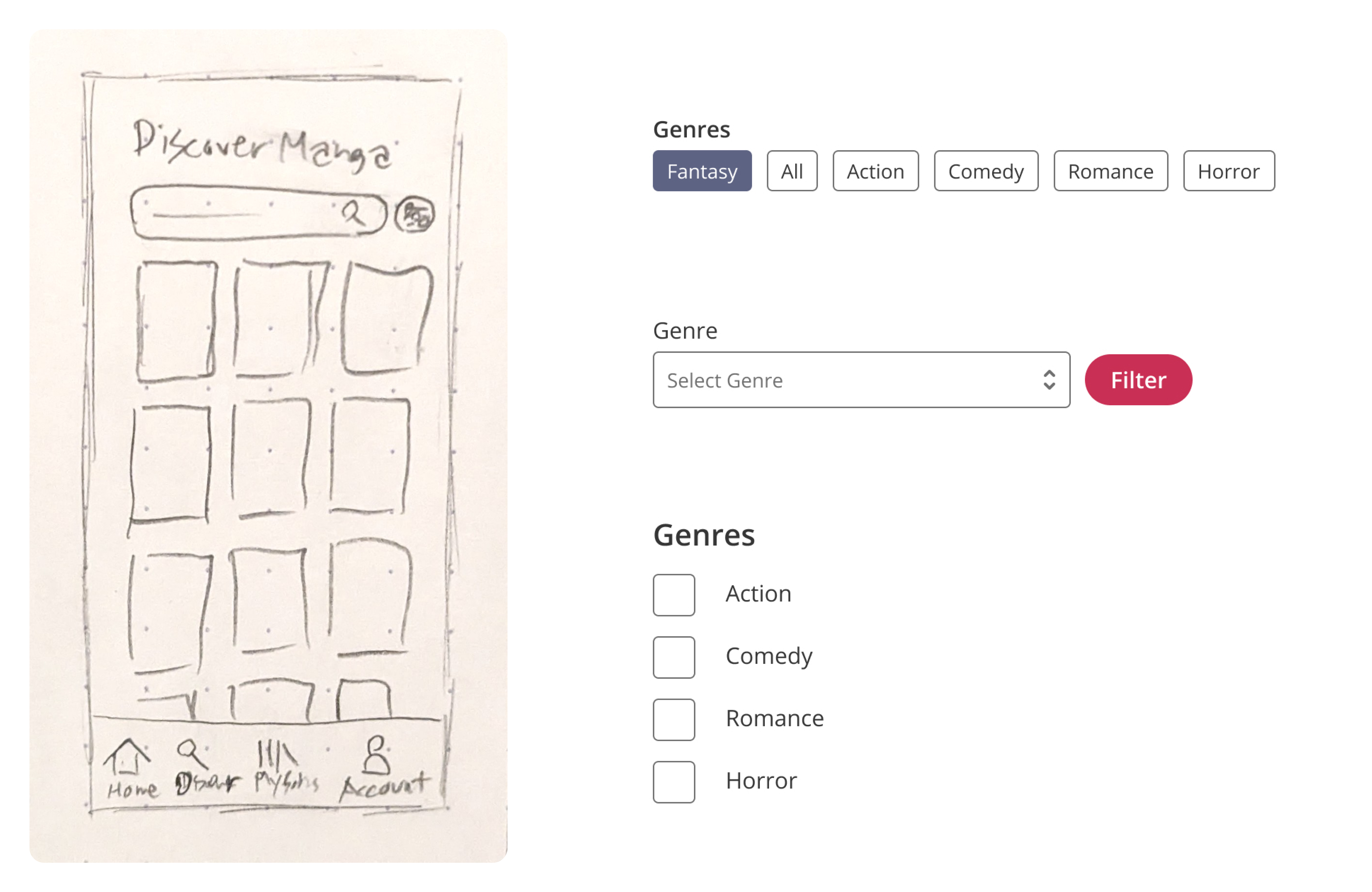
I explored design variations both in Figma and on paper, including options that exposed filters upfront and ones that hid them behind a progressive disclosure to give more focus to the content.
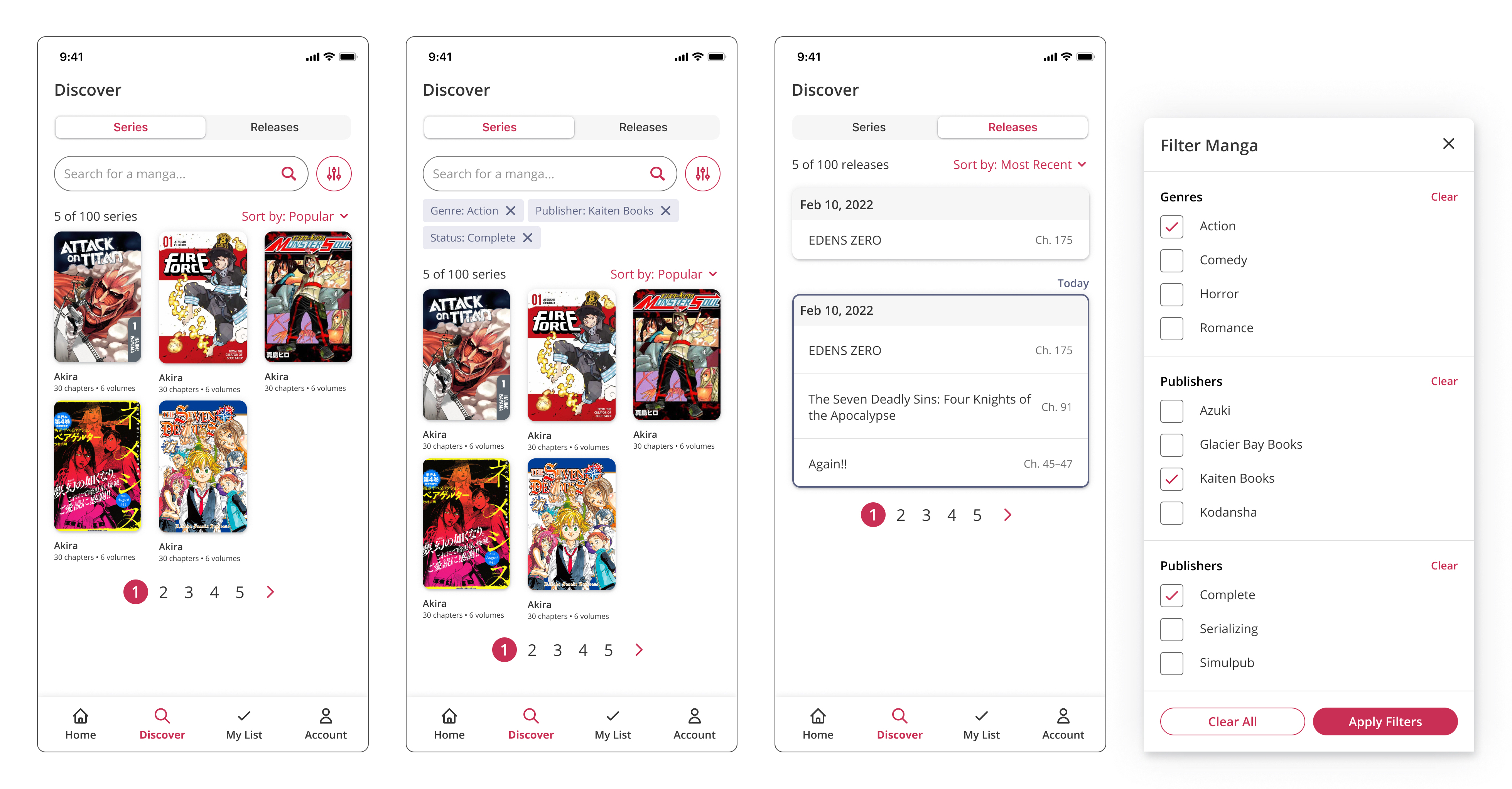
As much as possible I prioritized showing filter options upfront, without interaction. This enables the interface to train users by showing them what content categories are available. However, due to space limitations, I decided to place filters inside a modal sheet on mobile, while they are exposed by default in an embedded filter box on desktop.

Phase 3: Mockups
From there I polished the designs, including additional elements like pills to show the current filters and a way to view upcoming releases. I also added interactions like filter clearing.
Results
The new interface has been implemented on iOS and implementation is proceeding on Android and Web.
Among iOS users we recorded a 17% increase in chapter reads generated by the search page.