Case Study: GOGov Request Dashboard
Revamped a legacy list interface into a highly customizable home base for government employees
This content contains confidential information. To view it, please contact me to request a password.
Problem
GOGov is a software company with a Citizen Request Management (CRM) product that helps local governments respond to requests from residents. They had previously modernized the staff-facing list interface for their permits product, but the request list hadn’t caught up yet. They brought me in to unify these two products’ list screens while ensuring the new request list catered to the unique needs of its users.
Goals
- Bring the feature set from the permits product into the request list, including customizable sorting, filtering, and field selection
- Provide a map view for employees on the go or planning a route for the day
- Maintain key features from the original list feature, such as the ability to quickly reference photo attachments from the list
Phase 1: Research
The product manager had already decided the core feature set, but I proposed a design research phase to flesh out the details and validate our assumptions. This phase included:
Feature inventory: Listing all the current features across both the current and legacy list interfaces, and marking which ones must be retained for the new interface.
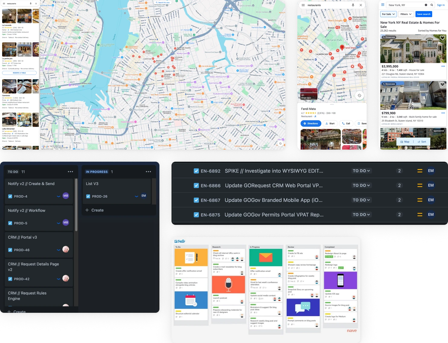
Competitive research: Exploring and screenshotting comparable interfaces including Google Maps, Trello, and Zillow.
User interviews: Speaking directly with city staff who use GOGov to uncover pain points in the current design and common user flows.
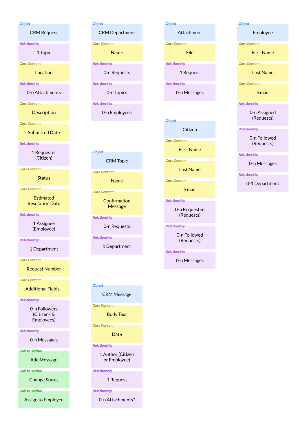
Object mapping: Defining the entities in the client’s system and their associated attributes and actions.
Phase 2: Flows & Wireframes
Based on the user interviews and feature inventory, I created three proposed user flows and refined them with the team:
- Assign & Deploy: Managers checking recent requests and assigning staff to work on them
- Plan: Staff in the field planning their route for the day to address residents’ requests
- Report: Office staff collecting aggregate data about requests over time
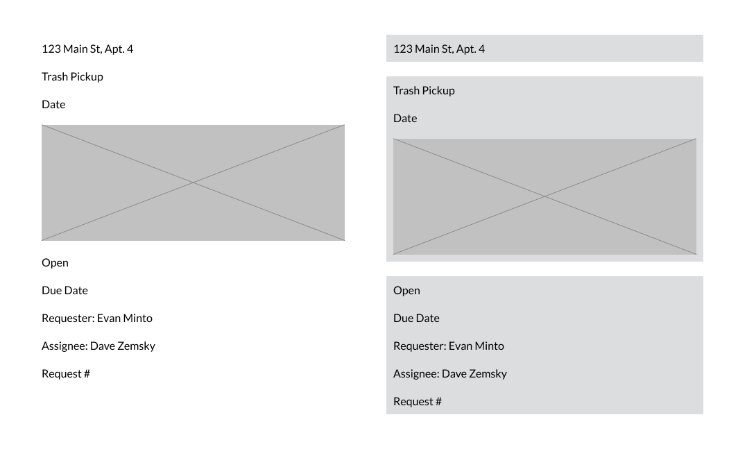
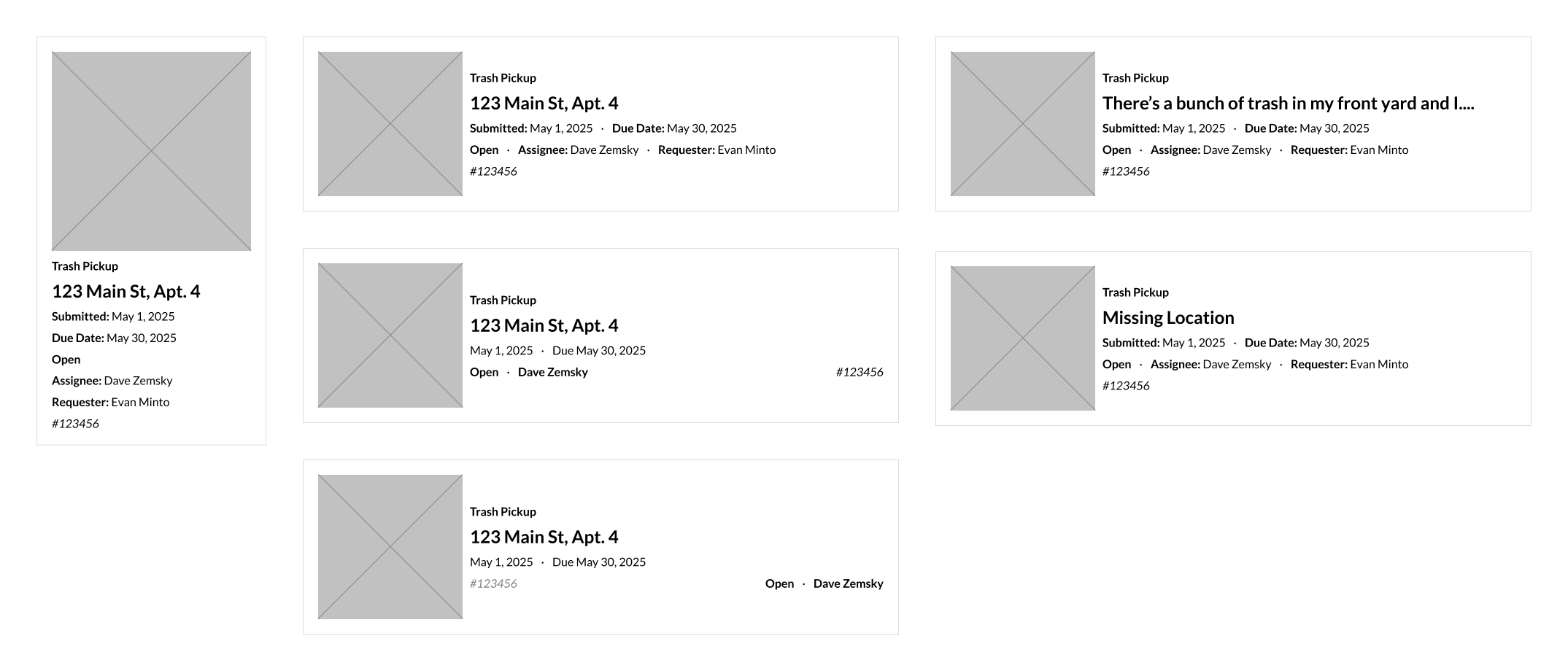
Since the request itself is the core resource of the design, I started working out its hierarchy, beginning with priority guides derived from the prior object mapping. Then I evolved those priority guides into wireframes.
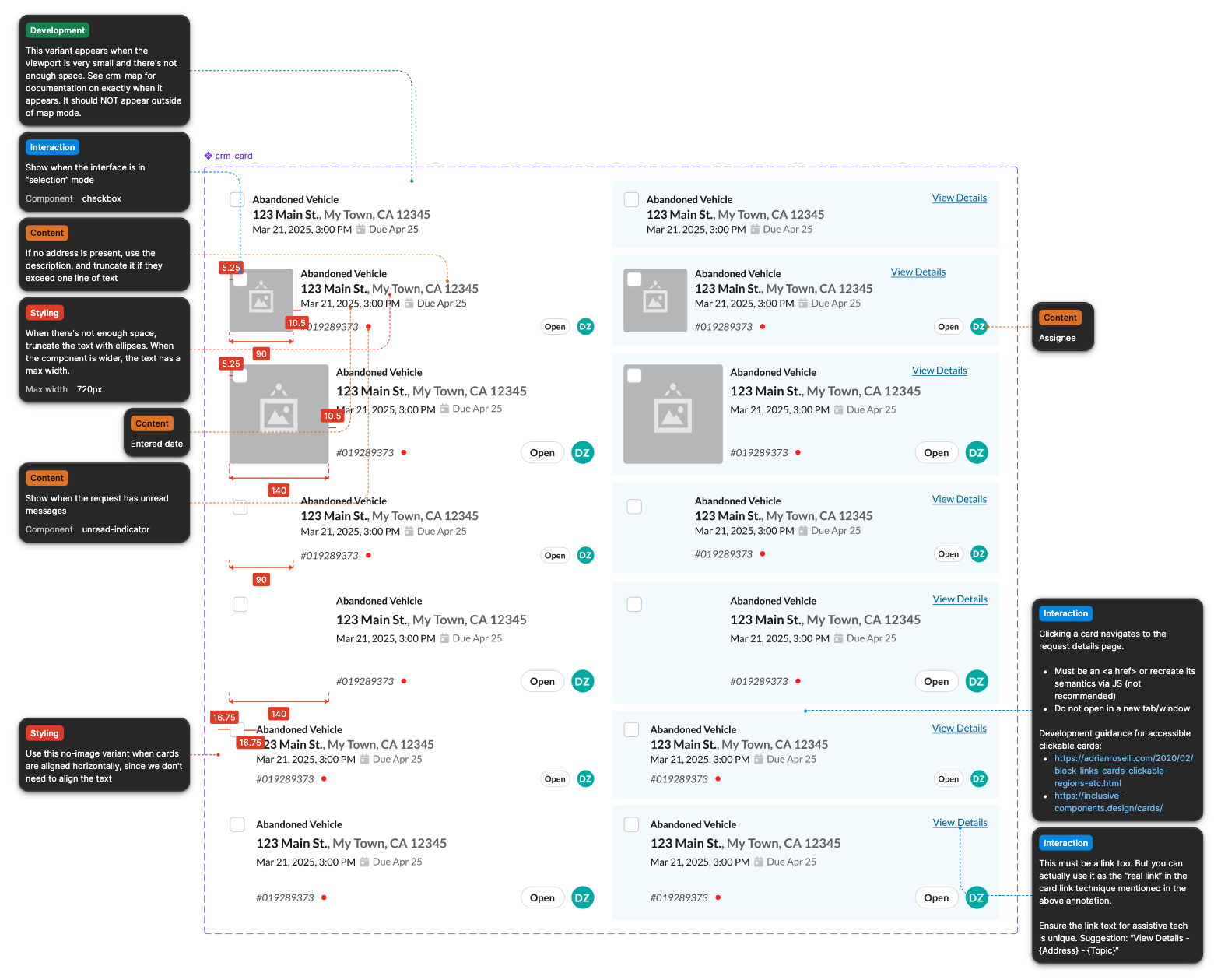
Because I had planned to base the overall page layout on the existing permits list, I focused my efforts on the request card itself. It would be the biggest deviation from the existing UI and the most important unit of the interface, the summary of each request that users would spend their time scanning and evaluating before taking action. The object mapping and priority guides already answered a lot of the hierarchy questions, but I experimented with layouts to figure out how to fit the most useful information in a small card and how to fall back when certain optional fields were missing.
Phase 3: Mockups
The previous interface was designed with desktop screens in mind. Responsive design was an important goal of the new UI, especially since users of map view could use it to plan routes on their phone or tablet when in the field. I approached the design with a mobile-first methodology.
I split the UI into three main views:
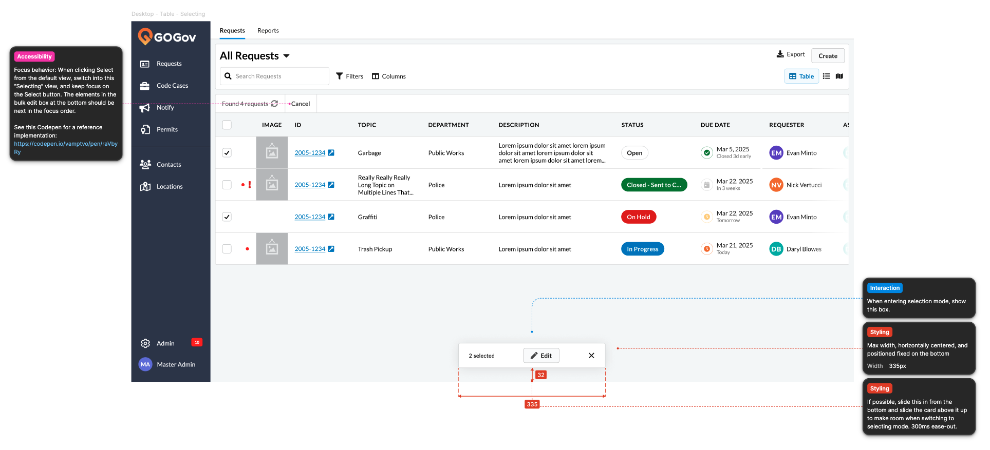
- Table: The existing Permits table view, applied to requests.
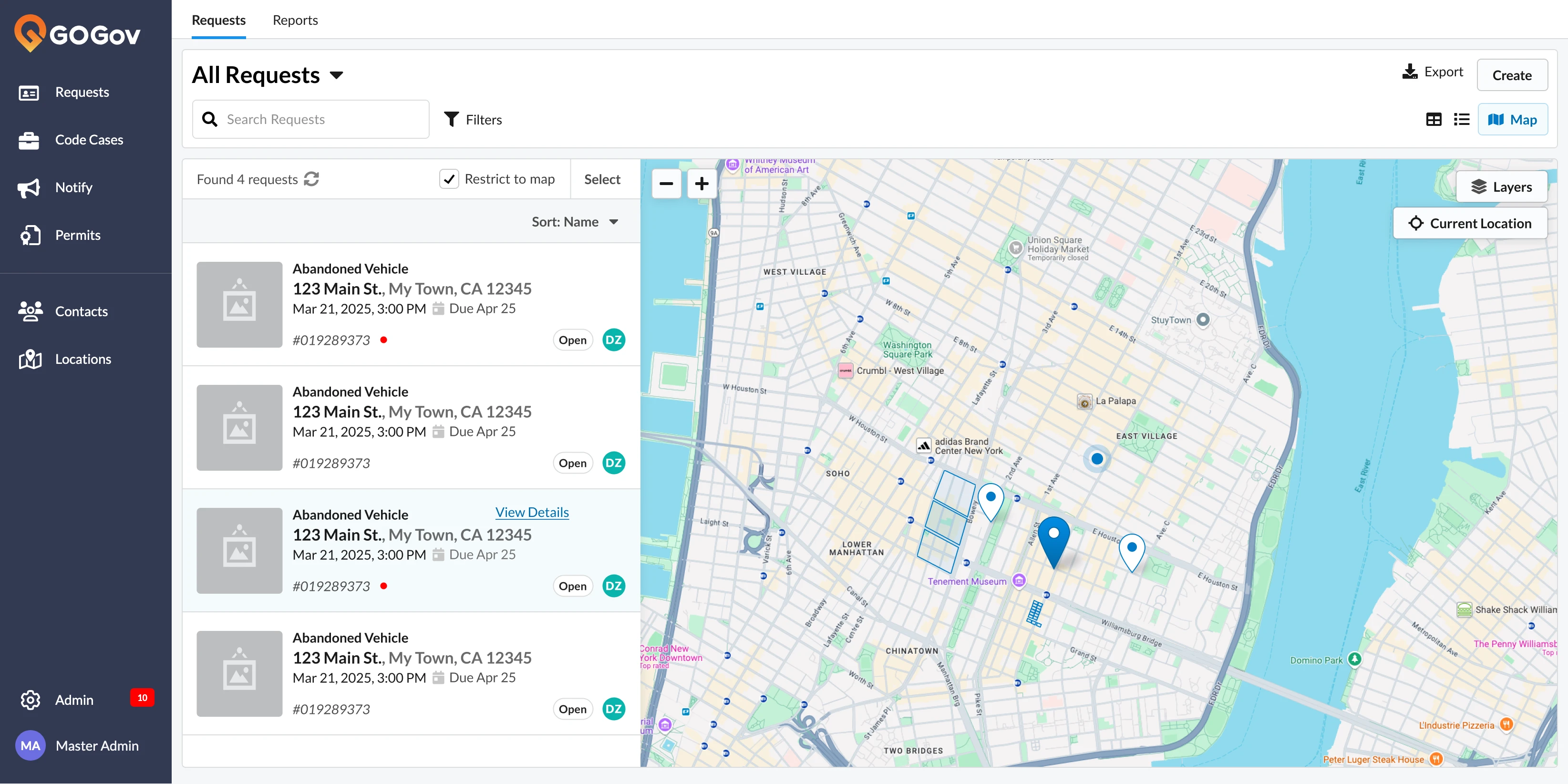
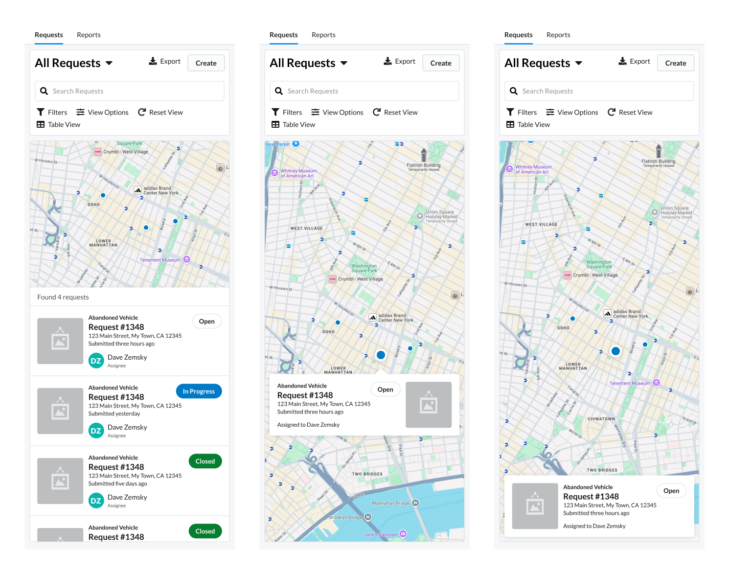
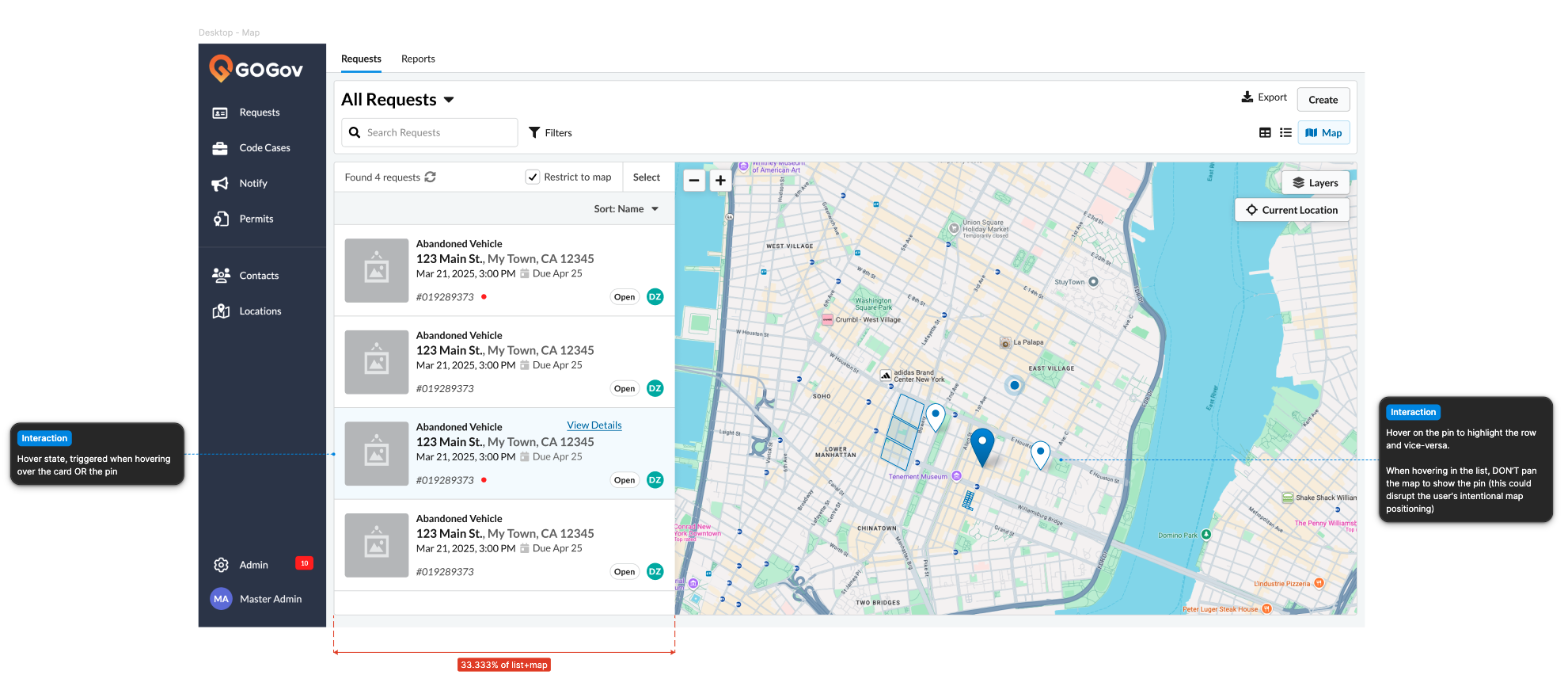
- Map: A Google Map with pins for each request and cards to show request details.
- List: An alternative to the table view that re-uses the Map cards and showcases image attachments for quick scanning.
I adapted the existing permits table to the request fields, integrating a new due date cell suggested by the client's in-house designer.
I experimented with different visual treatments of the request card wireframe, including a variant inspired by the client's emails to residents (a design I also created). I also relied on existing components as much as possible, including the Status Chip and Person components.
In map view, I tried some layout options inspired by various comparable websites and apps. The client and I evaluated the options and decided to switch the view based on screen size. On mobile, the map fill the screen and a single card at the bottom identifies the current request. On desktop, the map appears in a split-screen view, allowing us to provide the requests in a compact sidebar.
Inside the map, I added controls (including the ability to toggle layers with additional metadata and track the user's current location) adapted from a previous mapping project I worked on with the client.
The client had an additional request: the ability to bulk update requests. I experimented with always-visible checkboxes but instead created a toggle-able “select” mode inspired by iOS apps, to avoid distractions for the majority of use cases that don't involve bulk updates.
Phase 4: Final
The designs went through a few final rounds of review with the product manager and engineers. We identified missing interactions and edge cases, especially ones related to GOGov’s custom field system.
For the final version, I componentized most of the UI, including the request card, view toggle, list toolbar, table, and map. This included creating extensive properties and annotations to clarify the behavior for engineers and future designers. Whenever components were sufficiently generic to be usable outside of the request list, I promoted them to the client’s internal design system.
I was originally hired as an accessibility consultant for GOGov, and that commitment to accessibility carried through to my design work. New components were designed to WCAG 2.2 standards, and I created a convention in the design system for flagging legacy components not yet conformant with WCAG, to avoid regressions in WCAG conformance in the future.