Case Study: Azuki Manga Reader
Designed and built an interactive comic reader with multiple reading modes
Problem
Goals
- Prioritize content and get users to their manga fast
- Offer flexible ways to read and navigate to appeal to a diverse range of users
- Responsive and accessible interface that works across different devices, with shared elements and interactions for users switching between devices
Phase 1: Research
Early in the development of the product I had conducted extensive user and market research, including surveys and one-on-one interviews. Using that research as a springboard, I compared users’ favorite and least favorite competing manga reader apps, taking notes on features, interactions, and overall layout.
Not only were there different feature sets between different readers, but some readers used entirely different reading modes: official manga apps often used horizontal swiping to navigate between pages, while pirate manga websites provided all the pages in a single vertically scrollable list.
Phase 2: Exploration
Early on we decided to provide three different reading modes: single-page, two-page spread, and vertical scroll. Each required unique interactions and animations.'
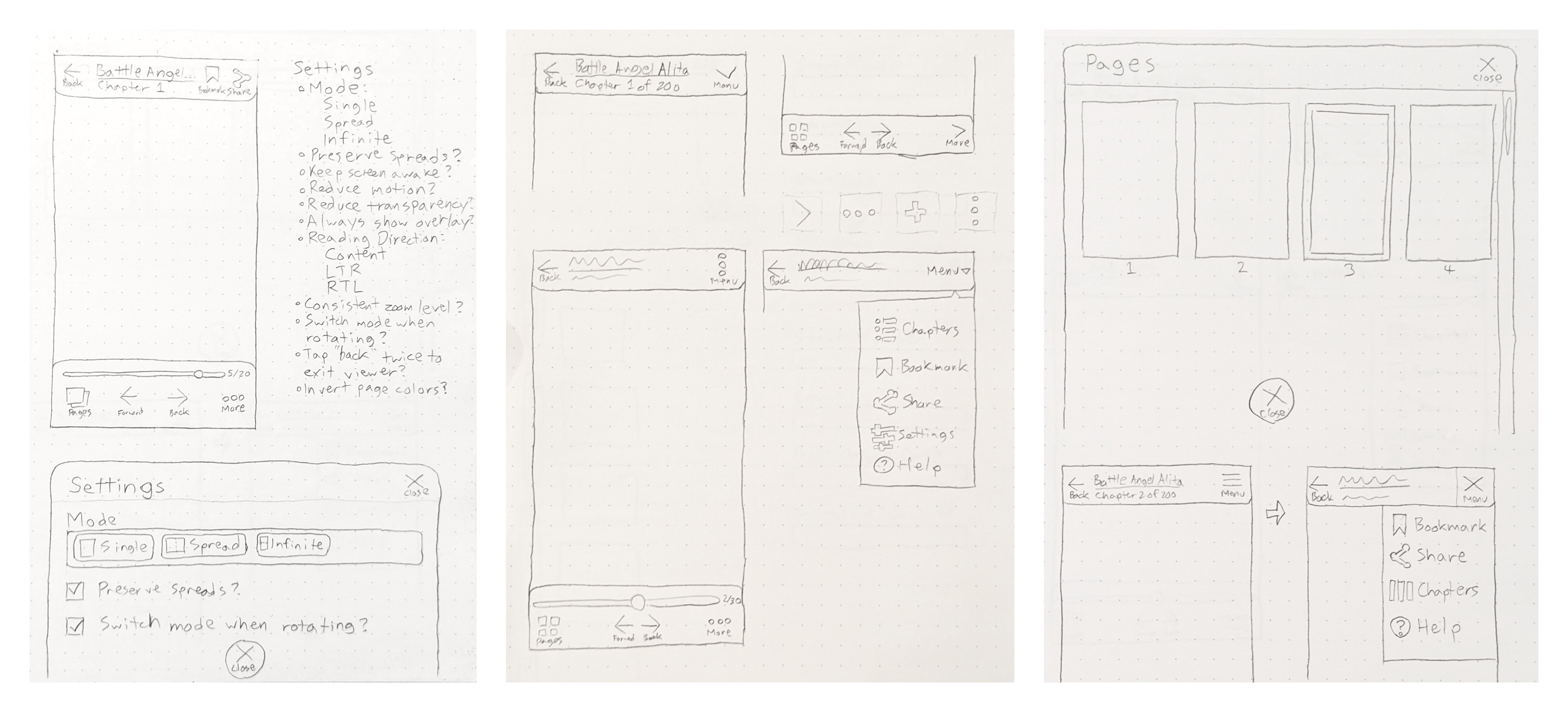
I also explored a number of different layouts for the reader controls, via pencil and paper sketches. The two most important types of controls were manga metadata (title, chapter number, etc.) and reading controls (back, forward, fullscreen, etc.). I eventually decided to place them on top and bottom of the manga page, leaving the content centered in the screen.
I opted for a partially transparent overlay that could be dismissed by tapping the manga page, a compromise between maximizing the content size and educating the user upfront about the interactions available in the reader. I translated this layout into Figma mockups before moving ahead to the next phase.
Phase 3: Prototype & Testing
I built out a prototype implementation using HTML, CSS, and Lit Web Components and conducted moderated usability tests with real manga fans. They enjoyed using the reader, especially the ability to choose their favorite reading mode.
However, the overlay consistently confused users, and some were unable to figure out how to dismiss it, leaving the content obscured by default.
Phase 4: Revisions & Final Mockups
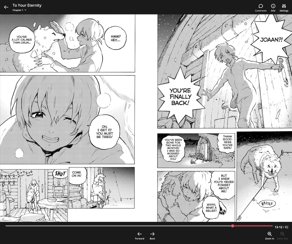
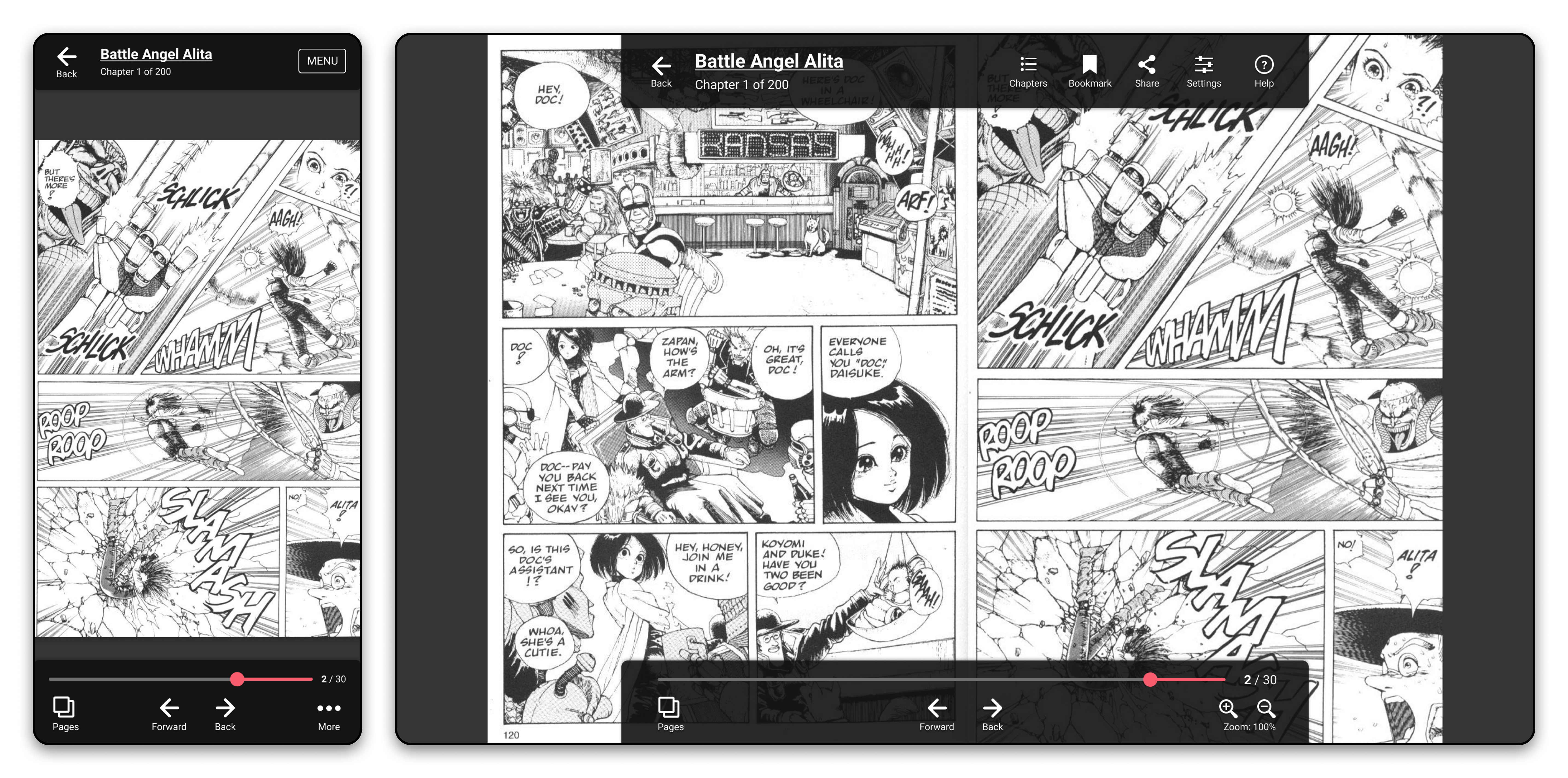
Hiding the controls by default would make it challenging to educate users on how to navigate the reader, so instead I decided to change how the controls worked. I redesigned the reader so that the controls still sat on the top and bottom, but they squished the manga pages, reducing the content height while the controls were open.
Users would be able to clearly see the controls when opening the reader and could see the full manga pages at all times, at the cost of slightly reducing the size of pages at first.
Phase 5: Production Code
I then proceeded to implement the new designs in the web app, and added extensive Google Analytics events to track which reading modes and navigation methods users most often used.
Azuki’s iOS and Android developers worked off of my cross-platform designs in Figma to build their respective readers as well.
Results
The reader is live on all three platforms now, and it has become one of our most lauded features. Anime and manga review website YattaTachi said “[Azuki’s] web reader is one of the best out there.”
Mobile web readership has consistently been a key growth driver for the app.